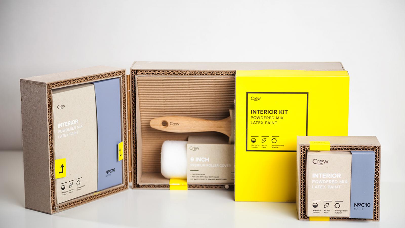
Is clever packaging a trick or a trait? A trick
in that visual elements distract the consumer from what's inside, or a trait;
such that the design the product is encased in enhances and promotes the known
quality of the product you're interested in? Well established products need
only have a familiar look. Visual elements needn't be extravagant or bold. New
products being introduced would do well to have that eyeball punching graphic
that can keep the attention of the consumer long enough to learn what it is.
The not so good product that struggles on the shelf (they're out there) might
not be helped by a design that is more interesting that what it's trying to
sell.
Packaging supplies, and the industry therein,
offer a myriad of challenges to those who wish to offer up their products to
the world. It's a cut-throat industry to be sure. competition is fierce, but
the bottom line is; a package means nothing if there's nothing in the package.
No amount of clever wording or graphic design or use of color will save that
which will not sell. Therefore, a symbiotic relationship must be forged between
product and package. This is no small task.
We the people ultimately decide. The consumer is
king in the world of marketing and package design. Whether a product sinks or
swims depends on a harmony between a product and that in which it's wrapped:
The almighty package.
Volumes of information in packaging have been
written and ages of time have passed since the miracle of packaging first
spawned. Now here we are, no closer to an easier solution to promoting the
products that we humans produce and sell to each other.
The mystery of why designs that have been
dismissed as grade school refrigerator scribbles succeed wildly, and tremendous
creative efforts by teams of battle hardened artists and designers fall flat,
is ageless. One might have better luck discerning the intricacies of string
theory versus quantum mechanics.

Everyone in the industry knows about these
un-explainable realities, and the battle goes on, but it's more often than not;
a herculean effort.
Alas the tireless designer persists and many
successes are world recognized and flying off of the shelves. It's the reward
of timeless fame that keeps the designer inspired to continue. That magical mix
of font, form and function which defies explanation and launches it's product
contained within to blinding success. That's the fuel for the designers fire.
To the victors go the spoils, and creating effective packaging is the main
battle.
Some can reach the top with a simple slogan.
Others can launch a successful product campaign with a clever graphic, but no
one has all the answers. Yet the efforts continue.
The world is filled with first rate package
designs and the variety and style continue to please the eye with endless isles
of products all vying for your attention. Creativity abounds and the products
they tout are ever getting better and better.
Few are aware of the level of effort that goes
into package design. Tremendous schools dedicated to Art & Design are
filled with talented people who can put quill to parchment and sketch out the
beginnings of professional designs for packaging. All for the consumer who
tears it up and tosses it out.